To craft effective websites compatible with various devices like computers & smartphones, one must utilize Cascading Style Sheets (CSS). CSS plays a vital role in determining the & structure of web pages.
An intriguing aspect of CSS is its capacity to adapt to diverse devices using media queries. These queries guarantee optimal display on any screen - whether a large computer monitor, tablet, or small smartphone.
For web developers striving for universally functional designs, understanding the importance of media query breakpoints in CSS is crucial.
Understanding CSS

What is CSS?
CSS, also known as Cascading Style Sheets, is a kind of language that tells web pages how to look. It helps decide how things appear on screens or paper and even other types of media.
CSS is super useful because it separates the words from the design stuff. This way, web pages can be changed easily without needing to mess with the actual words.
Importance of CSS in web development
CSS is an essential component of web development. It enables visual and interactive enhancements to web sites, allowing diverse styles to coexist and perform easily across various platforms. Key features include:
- Consistency: CSS ensures that a website's fonts, colors, and layout characteristics are used consistently throughout.
- Flexibility: Separating content from layout allows for quick and efficient modifications, which is essential for running huge websites.
- Page Load Efficiency: CSS files can be cached by the browser, reducing page load times by eliminating the need to reload or reinterpret styles with each page visit.
- Advanced Features: CSS has expanded into including animations, transitions, and grid layouts, which improve visual appeal and interactivity without the usage of JavaScript.
Media Query Breakpoints
What are media query breakpoints?
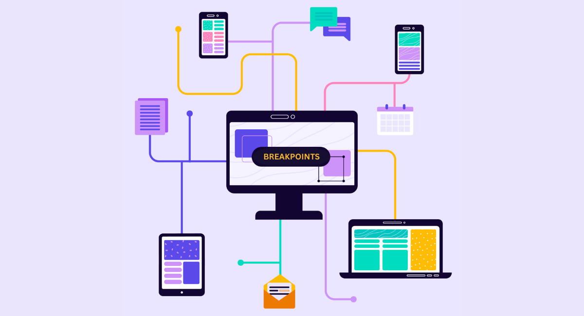
Media query breakpoints are CSS conditions that apply styles based on media properties like screen size, resolution, or device orientation.
These breakpoints are essential for designing responsive designs, which seek to give the best viewing and interaction experience across a wide range of devices.
Significance of media query breakpoints in responsive design
Media query breakpoints are pivotal in responsive web design since they allow developers to customize the website's layout for different devices.
This flexibility enhances usability and accessibility while guaranteeing the site's proper functionality on all devices, whether desktop, tablet, or smartphone. Effective media query breakpoints can:
- Improve the user experience by optimizing navigation and readability across multiple devices.
- Maintain design integrity while preserving functionality.
- Minimize the requirement for device-specific code, which reduces development and maintenance time.
How to use media query breakpoints effectively
To use media query breakpoints successfully, employ the following strategies:
- Base Breakpoints on Content: Instead of using conventional device widths, define breakpoints based on the content. This strategy ensures that the design appears good at all sizes.
- Begin with Mobile-First Approach: Create the design for the smallest screen and then expand. This approach optimizes performance for mobile devices, which often have limited resources.
- Extensive testing: Test on real devices and on emulators to guarantee that the website behaves as intended at each breakpoint.
- Keep It Simple: Use as few breakpoints as possible to make the CSS manageable and efficient.
- Use Relative Units: To maintain device scalability and flexibility, use relative units such as percentages or ems.
By effectively adopting these tactics, media query breakpoints can significantly improve a website's responsiveness, directly influencing user engagement and satisfaction.
CSS and Media Queries in Action

Examples of CSS and media query breakpoints working together
In web development, CSS and media queries collaborate to adapt a website's layout to various screen sizes and resolutions. Imagine a basic HTML webpage intended to appear differently on mobile phones, tablets, and desktop computers. Here's how CSS and media queries might function:
- Mobile phones: A media query could be used to apply specific styles when the screen width is less than 600 pixels. For improved touch engagement, consider a vertical layout and larger buttons.
- Tablets: When the device width ranges from 601px to 900px, another media query modifies padding, margins, and font sizes to make the most of the available space.
- Desktops: For screens larger than 901px, the media query may enable multi-column layouts, hover effects, and more subtle interactive features that rely on mouse input rather than touch.
This flexible adaption guarantees that users have a consistent experience across all platforms, while retaining usability and functionality.
Best practices for implementing CSS and media queries
When using media queries with CSS, there are various best practices to guarantee a strong and responsive design:
- Begin Mobile-First: Create CSS for mobile devices first, then scale up for tablets and PCs. This method aids in optimizing performance for mobile devices that often have slower internet connections.
- Use Relative Units: Use ems, rems, and percentages instead of fixed units such as pixels. This increases your layout's flexibility and adaptability to multiple screen widths.
- Test extensively: Regular testing across several devices and browsers is critical for identifying and correcting design errors.
- Keep it Simple: Don't overwhelm with too many breakpoints. Major breakpoints are usually sufficient unless a specific design requires greater precision.
Advantages of Responsive Design
Benefits of responsive design for websites
Responsive design provides several advantages:
- Expanded Reach: Your website becomes easily accessible across all devices, whether it's a smartphone tablet, or desktop.
- Cost Efficiency: Creating a single responsive version of a website proves more economical than developing multiple versions for different devices.
- Enhanced SEO: Search engines like Google prefer responsive designs, leading to increased visibility and higher rankings for your site.
- Enhanced User Satisfaction: A responsive site delivers an improved user experience, potentially boosting visitor engagement, retention, and conversion rates.
Impact of CSS and media query breakpoints on user experience
CSS and media queries directly influence user experience by ensuring that the website is accessible and aesthetically pleasing across all devices.
The breakpoints adjust the layout elements and interactive features based on the user's device capabilities and screen size, thus enhancing usability.
Smooth transitions between different breakpoints prevent elements from appearing misplaced or distorted, which can often frustrate users and lead to increased bounce rates.
Therefore, thoughtful implementation of CSS and media queries not only caters to visual aesthetics but also to functional adaptations that meet users’ needs.
Case Studies
Successful websites utilizing CSS and media query breakpoints
Various successful websites utilize CSS and media query breakpoints to enhance the user experience across different devices. Take Amazon, for instance.
They utilize CSS media queries to dynamically rearrange website elements, leading to an enhanced purchasing experience no matter if the user is on a desktop, tablet, or smartphone.
In a similar vein, the New York Times website implements media queries to adjust the size and layout of news stories and graphics. This ensures that the content is easily readable and interactive regardless of the screen size.
Lessons learned from real-world examples
Several significant lessons can be drawn from these cases.
- User Experience Consistency: Make sure your site is functioning and visually appealing on all devices.
- Testing is Critical: Conduct regular tests on many devices to identify and resolve issues that may affect how the media queries function.
- Begin Mobile-First: Designing for smaller screens first ensures that critical features are prioritized and then modified for larger screens.
These techniques demonstrate the value of responsive design in contemporary web development by demonstrating the skillful application of media query breakpoints and CSS to produce adaptable and user-friendly websites.
Book a Demo and experience ContextQA testing platform in action with a complimentary, no-obligation session tailored to your business needs.
Conclusion
In conclusion, CSS and media queries are critical components of modern web design, particularly for creating responsive websites that look beautiful on any screen, from desktops to smartphones.
Using media query breakpoints, developers may specify how websites should act and appear under specified conditions, such as different screen sizes or orientations.
As technology and device diversity increase, mastering CSS media queries will remain an essential skill for providing excellent user experiences.
Embrace the challenge of flexible design it's a worthwhile investment in the vast and dynamic world of web development.
Also Read - 11 Best CSS Grid Layout Generators For 2024
