Headers play a vital role in web design as they create the initial impact and establish the vibe for the user's browsing experience. This guide will walk you through practical steps to design and build visually captivating headers using CSS.
Whether you're a novice designer or a seasoned developer, learning CSS techniques for headers can significantly uplift the aesthetics and functionality of your websites.
We'll explore the fundamentals of CSS styling to craft headers that not only look stunning but also blend seamlessly with the overall design of your web projects.
Understanding the Importance of Headers in Web Design

The Role of Headers in Capturing Visitor Attention
The headers play vital role for a website because they are they are the first thing where the users land on. A well-crafted header can grab someone's attention right away and even shape what kind of experience someone is going to have on that site.
The tours earth users on the relevant contents as constituents and assists them for the further steps what to do next.
Headers that are visually appealing will not only help the site look more attractive - they will make the site easier to use and access, which is important in that it is the best way to ensure that visitors stay engaged and continue deepening into the site.
Impact of CSS Styling on Header Design
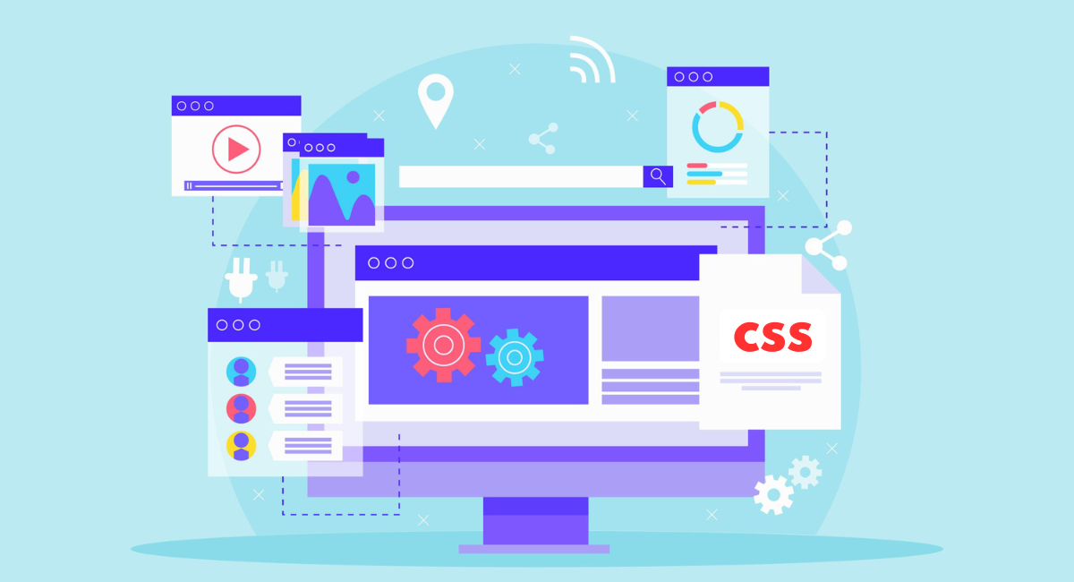
CSS (Cascading Style Sheet) provides a lot features for web designers to allow a website header to look good and function seamlessly. Designers are free to alter text styles, layout, color schemes, and interactive sections of the header with CSS.
In turn, they can design headers so that they are appealing to the eyes, but also useful for developers. A simple header can also be turned into a striking visual element that adds weight to a logo and contributes to user experience in general, but not without a bit of tasteful CSS styling.
Headers in CSS can be flexible and work wonderfully in a wide variety of scenarios and screen sizes.
Fundamentals of CSS for Header Styling
Custom Fonts and Typography
Fonts and text styles also exert considerable influence on the look and feel of the webpage, especially when it comes to header design.
Being able to control typeface, size, boldness, spacing, and alignment of text are all essential components of what make up beautiful and readable headers, and CSS gives designers that control.
You can add custom fonts using all desktop and web fonts properties using CSS, such as \`font-family\`, \`font-size\`, \`font-weight\`, and \`line-height\`, etc. Web fonts can be embedded via \`@font-face\` or loaded from hosting services such as Google Fonts.
Headings: Typographical headings must adhere to the branding style and tone of the website to maintain a consistent read.
Color Schemes and Palettes for Headers
Color is essential in design because it can stir up feelings and establish the atmosphere. You should think about how colors affect emotions and reflect the brand when picking color schemes for headers.
CSS simplifies the process of using and organizing colors using properties like \`color\` and \`background-color\`. Programs such as Adobe Color or Coolors are beneficial for developing pleasing color combinations that improve header designs.
It's important find a middle ground between contrast and harmony to make sure the header grabs attention while also blending well with the rest of the page layout.
Using CSS Grids for Layout Design
The CSS Grid Layout presents a robust tool for designers. It aids in crafting intricate, adaptable layouts with ease and uniformity. Consider headers, where CSS Grid comes into play by logos, navigation menus search bars meticulously.
Through \`grid-template-columns\`, \`grid-template-rows\`, and \`grid-area\`, properties designers gain exact command over elements' layout and size.
This method facilitates the of visually appealing yet functionally sound on various devices, thereby enrich the user's navigation effectively.
Advanced Techniques for Creating Dynamic Headers

Animation Effects with CSS Keyframes
CSS keyframes provide a powerful tool for adding animated visual effects to headers. These effects can range from subtle text fading to more complex background transitions.
To implement animations, define @keyframes at the beginning of your CSS. This includes specifying steps (or frames) of the animation, after which you link these keyframes to a selector. For example:
\`\`\`
@keyframes fadeIn {
from { opacity: 0; }
to { opacity: 1; }
}
.header {
animation: fadeIn 2s ease-out;
}
\`\`\`
This code will make the header fade in over a period of two seconds when the page loads. Experiment with different properties like \`transform\` for rotating or scaling to enhance the dynamic feel of your headers.
Incorporating Hover Effects and Transitions
Hover effects and transitions are crucial for enhancing user interaction and engagement. CSS transitions allow you to alter properties smoothly over a given duration, providing a polished look when users hover over header elements.
For instance, changing the color of a header item on hover could be achieved by:
\`\`\`
.header-item {
transition: color 0.5s ease;
color: black;
}
.header-item:hover {
color: red;
}
\`\`\`
This snippet gradually changes the color from black to red when the user hovers over the header item. Use similar transitions for other header properties like background-color or font-size to improve the interactivity of your site's navigation.
Creating Responsive Headers for Mobile Devices
Responsive web design is essential, and headers must adjust smoothly across different devices.
CSS media queries enable you to apply different styling rules based on the device characteristics like width, height, or orientation. For example:
\`\`\`
@media (max-width: 768px) {
.header {
font-size: 14px;
padding: 10px;
}
}
\`\`\`
This CSS will adjust the font size and padding of the header for screens smaller than 768 pixels wide, accommodating mobile devices. Always test your responsive headers extensively to ensure they appear correctly on various devices.
Best Practices for Optimizing CSS Headers
Minimizing Loading Time with Efficient CSS Coding
Efficient CSS can greatly impact the loading time of your website. Optimize performance by keeping your CSS lean, using shorthand properties, and minimizing the number of style sheets and CSS animations.
Also, consider using CSS preprocessors like Sass or LESS, which allow for better structuring and therefore cleaner and more efficient CSS output. Additionally, ensure that the CSS is minified to reduce the file size, speeding up header loading times.
Testing Header Designs Across Different Browsers
Cross-browser compatibility is crucial for a consistent user experience. Use tools like BrowserStack or Selenium to automate testing across multiple browser environments.
It's important to test CSS headers in browsers like Chrome, Firefox, Safari, and Edge to ensure that styles are consistently rendered. Pay particular attention to flexbox and grid layouts, which can behave differently in less compliant browsers.
Incorporating SEO Strategies in Header Styling
Headers play a key role in SEO because they typically contain heading tags (H1, H2, H3 etc.) which are critical for SEO. Ensure keywords are included in your headers and leverage CSS to enhance these elements without compromising on performance and accessibility.
For instance, maintain a logical structure in your header tags and use CSS to style these headers instead of creating text images which search engines can't parse effectively. This approach helps in maintaining both aesthetic appeal and SEO effectiveness.
Book a Demo and experience ContextQA testing platform in action with a complimentary, no-obligation session tailored to your business needs.
Conclusion
Creating engaging and functional headers using CSS significantly enhances the overall aesthetics and usability of your website.
By mastering the properties and techniques outlined, such as using Flexbox and CSS Grid for layout, incorporating responsive design, and adding dynamic interaction with pseudo-classes, you equip yourself with the tools needed to make your web projects stand out.
Always remember to test your headers on different devices to ensure they look great and function well across all possible user scenarios. Continuously exploring new CSS properties and techniques will also keep your design skills sharp and your websites looking modern and relevant.
Also Read - 15 Best Postman Alternatives for Automated API Testing
