
TL;DR: Web application development is the process of building software that runs in a web browser rather than being installed on a device. The global web development market reached $89.3 billion in 2026 with 28.7 million professional developers worldwide. This guide covers the complete lifecycle from architecture decisions through deployment and ongoing testing, with practical […]

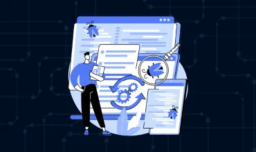
TL;DR: AI-powered QA uses machine learning to generate tests, heal broken selectors, classify failures, and select which tests to run based on code changes. The Stack Overflow 2024 Developer Survey found that 80% of developers expect AI to be more integrated into testing within the next year. This is not a future prediction. It is […]

TL;DR: Continuous testing is the practice of running automated tests at every stage of the CI/CD pipeline, from code commit to production deployment. It replaces the old model where testing happened in a single phase after development. The ISTQB Foundation syllabus positions continuous testing as essential to modern delivery, and the DORA research program shows […]

TL;DR: QA teams are moving away from Selenium because of high test maintenance costs, flaky execution, and the lack of built-in parallel testing. The most common migration paths in 2026 lead to modern open source frameworks with auto-waiting and better debugging, or to AI-native platforms that generate and self-heal tests without manual scripting. This guide […]
TL;DR: A defect found during production costs up to 100 times more to fix than one caught during design. The Consortium for Information and Software Quality (CISQ) estimates that poor software quality costs the United States $2.41 trillion annually. That figure includes operational failures, failed projects, technical debt, and cybersecurity breaches. This guide breaks down […]

TL;DR: Xcode is Apple’s integrated development environment (IDE) for building applications across iOS, macOS, watchOS, tvOS, and visionOS. It includes a source code editor, Interface Builder, simulator, debugger, Instruments profiler, and testing frameworks all in a single application. Xcode 16 (the current major version) introduced predictive code completion powered by on-device machine learning and support […]
TL;DR: The Software Development Life Cycle (SDLC) has seven phases: planning, requirement analysis, design, implementation, testing, deployment, and maintenance. Each phase has specific deliverables and quality checkpoints. Testing is not just Phase 5. Modern teams integrate quality checks across all seven phases through shift left and continuous testing approaches. This guide covers each phase with […]

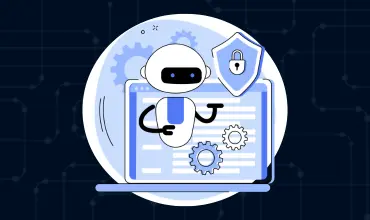
TL;DR: 89% of organizations are pursuing AI in quality engineering, but only 15% have scaled it. The World Quality Report 2025 shows the gap is not about technology. It is about mindset. QA teams hold AI to a perfection standard they never applied to human testers, and that double standard stalls adoption. This guide breaks […]
TL;DR: Severity measures how badly a defect damages functionality. Priority measures how urgently it needs to be fixed. They are not the same thing and confusing them costs teams real time. A misspelled company logo is low severity (no functional impact) but high priority (visible to every user). A crash on an obscure legacy browser […]

TL;DR: Test automation services help teams build, run, and maintain automated test suites without hiring a full in-house automation team. The three service models (staff augmentation, managed testing, platform-based automation) each fit different team sizes and budgets. This guide compares what to look for, common mistakes teams make when choosing a provider, and why platform-based […]
TL;DR: AI in software testing covers four practical capabilities: AI-powered test generation, self-healing test automation, automated root cause analysis, and intelligent test selection. The 2024 World Quality Report found that 45% of QA teams now use some form of AI in their testing process. This guide separates what actually works from the hype, with real […]

TL;DR: Mobile app security testing validates that an app protects user data, resists common attacks, and meets compliance standards across iOS and Android. The OWASP Mobile Top 10 (2024 update) defines the most critical risk categories. This guide covers practical testing methods from static analysis to dynamic scanning, API security validation, and how ContextQA integrates […]