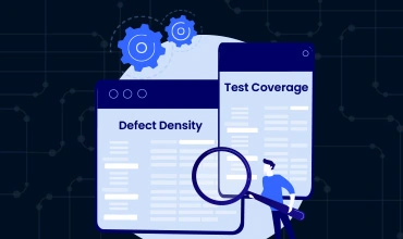
Time to confess: in the world of QA, we love our metrics (perhaps a bit too much). We track everything from test pass rates to bug resolution times. But when it comes to measuring the quality of our work, two metrics stand out: test coverage and defect density. For years, we’ve been told that these […]

Chances are, Salesforce is the lifeblood of your business. It’s where you manage your customer relationships, track your sales, and run your marketing campaigns. So, when something goes wrong, it can have a major impact on your bottom line. That’s where Salesforce testing best practices come in. A solid testing strategy can help you catch […]
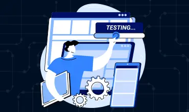
Let’s be honest, nobody really likes manual regression testing. It’s tedious, time-consuming, and let’s face it, a little bit boring. But it’s also a necessary evil. You have to make sure that your new features haven’t broken anything, and that means re-running a whole bunch of tests every time you release. But what if there […]

So, you need to do some performance testing. You know it’s important, you know it can save you from a world of hurt down the road. But where do you even start? There are a million and one performance testing tools out there, and they all claim to be the best. How do you cut […]

If you’ve been in the QA and web development world for a while, you’ve probably heard of Angular. But you might have also heard of its predecessor, AngularJS. And if you’re a tester, you might be wondering what the difference is and how it impacts your testing strategy. Well, you’ve come to the right place. […]
Automated regression testing is supposed to save you time, right? You invest all this effort into building a comprehensive suite of tests, and in return, you get a safety net that catches bugs before they make it to production. But what happens when you spend more time maintaining your tests than you do building new […]
With a jam-packed software development landscape, the pressure to release new features quickly is huge. However, speed without quality is a recipe for disaster. Bugs, glitches, and poor user experiences can erode customer trust and damage a brand’s reputation. This is where a strong foundation of Quality Assurance (QA) becomes critical. By implementing and adhering […]

So, you’re thinking about implementing a CI/CD pipeline. Good for you! It’s a huge deal for any development team, but it’s especially beneficial for testing teams. A well-implemented CI/CD pipeline can help you automate your testing, catch bugs earlier, and release with more confidence. But a CI/CD pipeline implementation is not a trivial undertaking. There […]
Let’s be real, traditional test automation is a grind. Writing and maintaining scripts is a time-suck, and flaky tests can drive even the most patient developer insane. It’s no wonder that teams are ditching their old-school tools and switching to AI-powered QA platforms. But with so many options out there, how do you choose the […]

You’ve built a great product. The code is clean, the features are solid, and you’re ready for users to start rolling in. But then you notice something alarming: users are dropping off. They’re visiting your site, maybe even adding items to their cart or starting the sign-up process, but they’re not converting. What gives? Chances […]

The DORA State of DevOps Report 2024 has some numbers that should change how you think about deployment. Elite performing teams deploy on demand, often multiple times a day, with change failure rates below 5%. Low performing teams? They deploy monthly and see failure rates above 45%. Understanding these metrics is essential for optimizing your […]
Here’s a stat that should bother you: the Capgemini World Quality Report 2024-25 found that 60% of organizations say inadequate test coverage is directly responsible for their production defects. Six out of ten. And yet, when I talk to engineering teams about their testing strategy, the conversation almost always stalls on the same confusion. They […]