


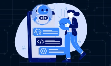
Low code test automation tools have become a practical option for teams that want faster feedback without adding more scripting work. As applications grow and release cycles shorten, manual testing alone no longer keeps up. Many teams now rely on low code testing AI to create and maintain tests with less setup and less ongoing […]
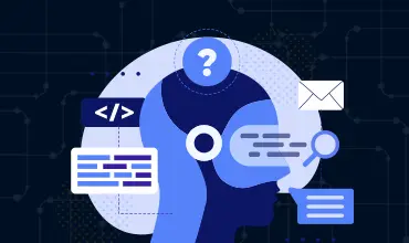
AI systems are making more decisions inside modern software, from flagging unusual activity to recommending actions or blocking requests. When something goes wrong, teams need more than just a result. They need to understand why the system behaved the way it did. That’s where explainable AI comes in. Explainable AI focuses on making AI decisions […]

AI prompt engineering has become part of everyday testing work as teams rely more on AI to generate test cases, flows, and datasets. In software testing, prompts are not casual inputs. They are instructions that determine whether generated tests are usable, repeatable, and aligned with real product behavior. When AI prompt engineering is handled carefully, […]

AI plays a growing role in fintech products, across start-ups and established players alike. From fraud detection to transaction monitoring and customer verification, AI systems help companies process large volumes of data with speed and consistency, freeing up teams for other tasks and helping to reduce human error. For developers and QA teams, this creates […]
Before any release, teams need a clear picture of how well a product behaves. Test coverage techniques help answer a basic question: what have we checked, and what still looks uncertain? These methods highlight areas that might need more attention and give developers and stakeholders a clearer sense of software quality. Different approaches can confirm […]
Test automation is now a standard part of modern software work, across multiple industries. It helps teams handle growing product complexity, faster deployment cycles, and rising expectations from users. Instead of repeating the same steps by hand, developers and QA testers rely on automated checks to confirm how the system behaves across environments. Tools like […]
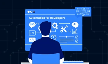
AI has moved into everyday development work (and everything else). It reduces manual steps, shortens review cycles and helps teams keep up with frequent updates. Knowing how to use AI to automate tasks is becoming a basic part of building and maintaining software. Developers handle new features, bugs, test updates and deployment steps, so AI […]
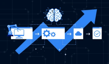
How Intelligent Process Automation Works Intelligent process automation brings together automation and AI to handle tasks that used to require hours of manual effort. For software developers and QA teams, this shift helps reduce bottlenecks, clean up workflows and improve release stability. It is now common in digital products, support tools, cloud infrastructure and internal […]
What Is a Prompt in Generative AI? Let’s start with the basics. A prompt is the text or input that tells a generative AI model what to produce. Essentially, it’s the instruction that tells the AI what you need it to do. The model uses that input to create an answer, generate code, summarize content […]
Modern applications evolve quickly, and teams often struggle to maintain coverage across so many changes. Manual testing creates bottlenecks, especially when releases are frequent and workflows are complex.

AI is now embedded across modern eCommerce platforms, from search and recommendations to pricing and customer support. For development and QA teams, this creates a different challenge: not understanding what these systems do, but reliably building, testing, and maintaining them as they change. AI-driven features introduce dynamic behaviour that is harder to predict and harder […]
AI can support healthcare platforms in ways that would be difficult to achieve with traditional logic. For software teams, this creates opportunities to automate tasks that used to require manual review.