Nail Responsive Design: 6 Must-Have Testing Tools
Responsive design is a design approach aimed at crafting websites to provide an optimal viewing and interaction experience across a wide range of devices, from desktop computers to smartphones and tablets. This adaptability is achieved by using flexible grids, layouts, images, and CSS media queries.
Responsive design involves creating a single website that can intelligently adjust its layout, images, and content to suit the screen size and resolution of the device being used. It ensures a consistent user experience regardless of whether the visitor is using a large desktop monitor, a mid-sized tablet, or a small smartphone. The key components of responsive design include fluid grids, flexible images, and media queries.
The Need for Testing Tools

Overview of the Complexities in Testing Responsive Design
Testing responsive design introduces a set of complexities due to the diverse nature of devices, browsers, and screen sizes. Some of the challenges include:
Device Diversity:
The myriad of devices available, each with its own screen size, resolution, and capabilities, makes it challenging to test a website on every possible configuration manually.
Browser Compatibility:
Various web browsers interpret code differently. Ensuring compatibility across popular browsers such as Chrome, Firefox, Safari, and Edge is essential for a consistent user experience.
Dynamic Content:
Responsive design often involves dynamically changing content based on user interactions or device characteristics. Testing these active elements across devices requires thorough consideration.
Performance Variability:
Responsiveness goes beyond visual presentation. Testing the performance of a website on different devices and network conditions is crucial to ensure optimal loading times and smooth user interactions.
Cross-Platform Consistency:
Apart from testing on different devices, ensuring consistency across platforms (iOS, Android, Windows) adds another layer of complexity, as each platform may have its design guidelines and quirks.
Importance of Using Testing Tools for Efficient Development
To address the complexities of testing responsive design efficiently, developers leverage testing tools. The importance of using such tools includes:
Automation:
Testing tools automate repetitive tasks, allowing developers to test across multiple devices and browsers more quickly and accurately. Automated testing ensures a consistent and reliable evaluation of responsive design.
Cross-Browser Compatibility:
Testing tools can simulate various browsers and their versions, helping identify and address compatibility issues early in the development process. This ensures a smoother experience for users, regardless of their choice of browser.
Device Emulation:
Testing tools often provide device emulation features, allowing developers to simulate the behavior of websites on different devices without the need for physical devices. This helps catch issues related to specific device characteristics.
Performance Testing:
Tools for performance testing assess how well a website performs under different conditions. This includes evaluating loading times, responsiveness, and the overall user experience on various devices and network speeds.
Regression Testing:
As websites evolve and new features are added, testing tools facilitate regression testing to ensure that updates do not introduce issues that compromise the responsiveness of the design.
Ensuring a Consistent User Experience Across Devices
Testing tools play a crucial role in ensuring a consistent user experience across devices by:
- Identifying Issues Early: Testing tools help catch responsive design issues early in the development process, reducing the likelihood of users encountering problems.
- Streamlining Development Workflow: Automated testing tools streamline the development workflow by providing quick feedback on potential issues, allowing developers to address them promptly.
- Efficient Bug Resolution: When issues are identified, testing tools aid in efficiently pinpointing the source of the problem, expediting the debugging and resolution process.
- Enhancing Collaboration: Testing tools often facilitate collaboration among developers, designers, and QA teams, fostering a more integrated and efficient approach to responsive design testing.
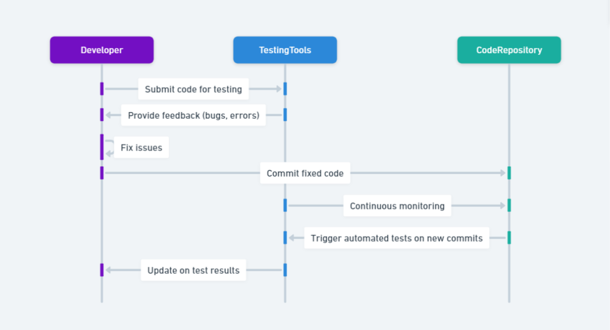
These tools help identify issues early, ensure cross-browser compatibility, and contribute to a consistent user experience across the vast array of devices in use today. Incorporating testing tools into the development process is essential for delivering high-quality, responsive websites that meet the expectations of modern users.
6 Must-Have Testing Tools for Nail Responsive Design
Testing tools play a crucial role in ensuring that a website or application is responsive and functions well across different devices and screen sizes. Here are six must-have testing tools for nailing responsive design:
Google Chrome DevTools:
-
- Description: Chrome DevTools is a built-in set of web developer tools in the Google Chrome browser. It provides a range of features for inspecting, debugging, and optimizing web pages.
- Key Features: Device Mode: Simulates different devices and screen sizes.
- Responsive Design Mode: Allows you to test how your site looks on various screen resolutions.
- Network Throttling: Simulates different network conditions for testing performance.
- Description: Chrome DevTools is a built-in set of web developer tools in the Google Chrome browser. It provides a range of features for inspecting, debugging, and optimizing web pages.
BrowserStack:
-
- Description: BrowserStack is a cloud-based testing platform that allows you to test your website or application on a wide range of real browsers and devices.
- Key Features: Cross-browser testing: Ensures compatibility across different browsers.
- Accurate device testing: Tests on real mobile devices to ensure responsiveness.
- Description: BrowserStack is a cloud-based testing platform that allows you to test your website or application on a wide range of real browsers and devices.
LambdaTest:
-
- Description: LambdaTest is another cloud-based testing platform that provides a scalable environment for cross-browser testing.
- Key Features: Browser Compatibility: Tests on a variety of browsers and operating systems.
- Real-time testing: Allows real-time interaction with the website on different devices.
- Description: LambdaTest is another cloud-based testing platform that provides a scalable environment for cross-browser testing.
Responsinator:
-
- Description: Responsinator is a simple web-based tool that helps you quickly preview how your website will look on various devices.
- Key Features: Multi-device preview: Shows how your site appears on different devices simultaneously.
- Quick and easy to use: No installation required.
- Description: Responsinator is a simple web-based tool that helps you quickly preview how your website will look on various devices.
Am I Responsive?:
-
- Description: Am I Responsive is a straightforward and easy-to-use tool that provides a quick preview of your website on various devices.
- Key Features: Four-device preview: Shows your website on a desktop, laptop, tablet, and mobile.
- No setup required: Instantly see the responsiveness of your site.
- Description: Am I Responsive is a straightforward and easy-to-use tool that provides a quick preview of your website on various devices.
W3C mobileOK Checker:
-
- Description: Developed by the World Wide Web Consortium (W3C), the mobileOK Checker evaluates how well a webpage conforms to mobile web best practices.
- Key Features: Mobile web best practices: Check if your site adheres to recommended mobile design principles.
- Provides a score: Helps you identify areas for improvement in mobile optimization.
- Description: Developed by the World Wide Web Consortium (W3C), the mobileOK Checker evaluates how well a webpage conforms to mobile web best practices.
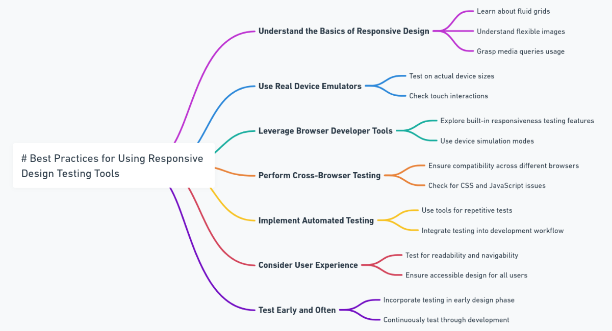
Best Practices for Using Responsive Design Testing Tools
Integrating Testing Tools into the Development Workflow
Early Integration:
Integrate responsive design testing tools early in the development process. Incorporate them into your continuous integration/continuous deployment (CI/CD) pipeline to catch issues at the earliest stages.
Collaborative Approach:
Foster collaboration between developers, designers, and QA teams. Ensure that everyone involved in the project is familiar with and has access to the testing tools, promoting a unified approach to responsive design testing.
Automation Integration:
If the testing tool supports automation, integrate automated testing scripts into your development workflow. This helps streamline the testing process and ensures consistent results across different devices and browsers.
Feedback Loop:
Establish a feedback loop between testing and development teams. Encourage quick communication and resolution of issues identified during testing to maintain an efficient development cycle.
Conducting Thorough Testing Across Various Devices and Browsers
Device and Browser Coverage:
Prioritize testing on a diverse set of devices and browsers. Consider the most popular ones used by your target audience and ensure comprehensive coverage to identify potential issues early.
Accurate Device Testing:
When possible, conduct testing on real devices in addition to virtual testing. Real device testing provides a more accurate representation of how your website will perform on different hardware configurations.
User Scenarios:
Test responsive design with various user scenarios. Consider different user interactions, such as form submissions, navigation, and media playback, to ensure a seamless experience across diverse devices.
Performance Testing:
Beyond visual aspects, include performance testing in your responsive design testing strategy. Evaluate loading times, responsiveness, and resource usage under different conditions to deliver an optimal user experience.
Regularly Updating Testing Tools for Compatibility with New Devices
Stay Informed About Updates:
Keep abreast of updates and new releases for your chosen testing tools. Regularly check for updates to ensure compatibility with the latest browsers, devices, and operating systems.
Testing Tool Configuration:
Configure testing tools to automatically check for updates or set up a schedule for manual updates. This ensures that the tools are always equipped to handle the latest technologies and devices.
Feedback to Tool Providers:
Provide input to the testing tool providers. If you encounter issues or find that specific devices are not adequately supported, communicate with the tool’s support team. This helps in improving the tool’s capabilities over time.
Evaluate New Tools:
Periodically evaluate new testing tools that may offer enhanced features or better compatibility with the evolving landscape of devices. Consider adopting new tools if they align with your project’s requirements and goals.
By following these best practices, you can seamlessly integrate responsive design testing into your development workflow, ensure thorough testing across various devices and browsers, and keep your testing tools up-to-date for optimal performance and compatibility.
This proactive approach contributes to delivering a responsive and consistently high-quality user experience across the ever-changing landscape of web technologies.
Nail Responsive Design
Responsive design remains a cornerstone of modern web development, addressing the dynamic landscape of devices and user preferences. The combination of responsive design principles and practical testing tools is indispensable for creating websites that not only meet the needs of today’s users but also adapt to the challenges and innovations of tomorrow.
By embracing responsive design and incorporating robust testing practices, developers contribute to a digital landscape that is accessible, user-friendly, and future-ready.
You may also be interested in Automated Testing Solutions: Reduce Backlogs Efficiently.
Book a Demo and experience ContextQA testing tool in action with a complimentary, no-obligation session tailored to your business needs.
We make it easy to get started with the ContextQA tool: Start Free Trial.